The difference between reader and presenter decks
In the course of raising funding for a startup, founders will inevitably create countless different presentations: from investors pitch decks to sales proposals. When crafting pitch decks and presentations, it is important to note the distinction between a reader deck and a presenter deck:

What’s the difference between a reader deck & a presenter deck?
Reader decks and presenter decks are two different formats of presentations that serve different purposes. While reader decks are meant as “standalone” documents for self-guided reading, presenter decks are meant for active delivery by a presenter.
Reader decks are designed to be read independently: they are meant to be consumed by the reader without the presenter’s interaction. Given the fact that these presentations are meant to stand on their own, they generally include more longform text, complex charts and specific details than presenter decks. Reader decks are typically shared as PDF documents (or via software such as Docsend) and do not feature animations. Most investor presentations take the form of reader decks, since founders usually make their first connection with prospective investors online or via email.
Presenter decks, on the other hand, are designed to be delivered by a presenter to a live audience (ie. at an accelerator demo day). They are generally meant to be presented in-person (or remotely) and require the presenter’s active involvement. Presenter decks are typically simple and straightforward, containing information that is easy to digest and understand. Most will feature shortform text, simple graphics, and limited animation or video where appropriate (ie. GIFs of app interfaces). Presenter decks often feature punchy & concise, “keynote”-style slides with very little text that focus only on the high-level detail. They are meant to grab the audience’s attention and hold it, highlighting the most memorable and impactful information while allowing the presenter to add context.
Another key difference between reader and presenter decks is the level of detail they contain. Reader decks tend to be more detailed, providing a comprehensive overview of the startup. They often contain more text and data, given they are meant to be read thoroughly and don’t have any time limit. That said, most popular pitch deck formulas (ie. Sequoia, Y-Combinator, and Airbnb), agree that 15 slides is the sweet spot in terms of presentation length.
Presenter decks, on the other hand, are more high-level: summarizing key information in a way that is easy to understand and remember. The slides are generally less text-heavy and omit specific data, since these presentations are meant to provide a quick, easy-to-digest overview within a short period of time (usually under 3 minutes).
When creating any presentation, determining whether it will be a reader or presenter deck is a critical preliminary step to ensure the design and copywriting approach is appropriate for the audience and use case.
What are some examples of reader & presenter decks?
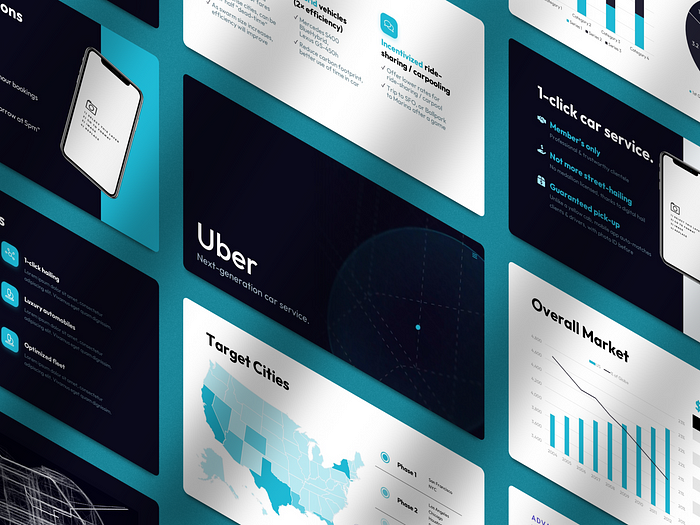
A great example of a reader deck is Uber’s original 25-slide pitch deck: the very first presentation that UberCab co-founders Travis Kalanick and Garrett Camp created in late 2008. They would raise $200k in seed funding that year. This in-depth deck was designed to provide potential investors with a comprehensive overview of the company’s purpose, market, and future prospects. Although the text and graphics are minimalist & clear, the focus is on including all the salient data and information to get prospects interested.

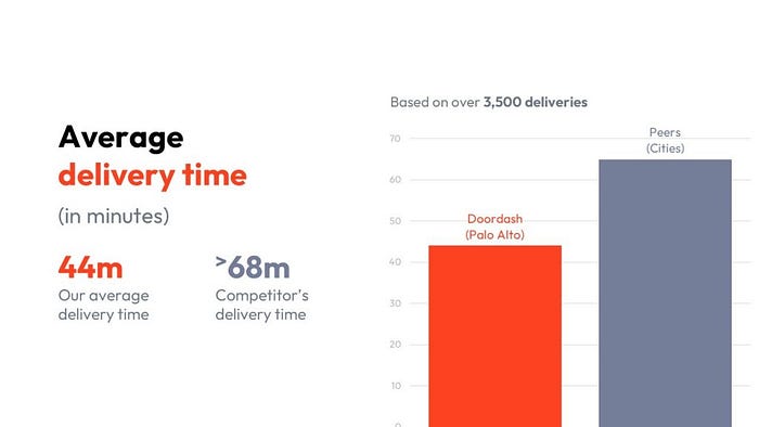
In contrast, the 10-slide DoorDash deck from Y-Combinator’s Summer 2013 Demo Day is a great example of a presenter deck. This deck was used to introduce the company to potential investors at Y-Combinator’s annual demo day. The differences from the Uber pitch deck are notable: every slide in the DoorDash deck follows Guy Kawasaki’s 10/20/30 rule, with less than a couple sentences on each slide, featuring large, eye-catching typography and imagery. Co-founder & CEO Tony Xu delivered this presentation in less than 2.5 minutes in August 2013, going on to raise $2.3 million in early-stage funding that year.

To summarize, reader and presenter decks serve different purposes and are designed with different audiences in mind. Reader decks are meant to be consumed passively and provide a comprehensive overview of the information. Presenter decks are intended to be delivered by a live presenter and focus on providing a high-level overview of the information in an engaging and memorable manner. Both formats have their strengths and weaknesses, and it’s important to choose the right format for the right audience and purpose.
How to create a reader or presenter deck
Whether you’re creating a reader or presenter deck, we have you covered. Our pitch deck experts have helped clients close over $100M+ in deals & funding, and we’ve distilled this knowledge into our professional-grade pitch deck templates, trusted by thousands of customers worldwide:
- If you’re creating a reader deck, you may be interested in our Silicon Pitch Deck template — or you may prefer to choose one of our 40+ industry-specific investor presentation templates.
- If you’re creating a presenter deck, the 3-min Pitch Deck and DoorDash Pitch Deck templates are both excellent choices to jumpstart the process.
If you found this helpful, please do share with other founders and colleagues you may find it useful. Best of luck with your next presentation!
Originally published at https://vip.graphics on January 30, 2023.
